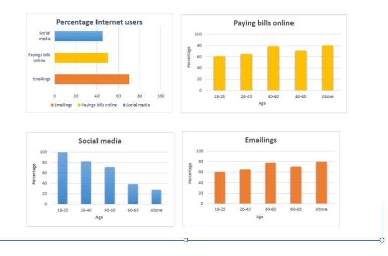
The charts below show internet use for different purposes in Australia in 2010 and2011 and the percentage by users.
Summarise the information by selecting and reporting the main features and make comparisons where relevant.

Sample report
The bar graphs show the different purposes for which the internet is used and the age of people using it. Overall, it can be seen that the internet was mainly used by Australians for emailing. It was also used for paying bills online and social media. While as much as 70 percent of Australians used the internet for emailing in 2010 and 2011, only about 45 percent of them used it for social media. Nearly 50 percent of them also used the internet for paying bills online.
Internet uses like emailing and paying bills online were popular among people of all ages. This use was particularly common among those in the 40-60 and above 65 age brackets. The percentage of people using the internet for social media showed a downward trend with an increase in age. While 100 percent of young people (18-25) used the internet for social media, less than 30 percent of seniors used it for this purpose.
Tips
Here the bar graph gives data for the years 2010 and 2011. These years are obviously in the past. Hence, while describing the given data, use the simple past tense.
The first sentence of your report which explains what the given data is about should be in the simple present tense.
Write something like:
The chart shows…
The table illustrates…
The process diagrams shows various processes involved in …
The bar chart depicts information regarding…
Need help with IELTS writing? Get your writing samples corrected by me.